


 Url copied to clipboard.

Timeform launched Pace Maps for races on the Flat to Race Passes customers back in June 2016.
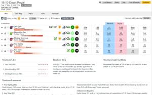
These Flat Pace Maps estimate the likelihood of a horse recording each of the five possible Early Position Figures (EPF) in a given race. To arrive at these possibilities, a number of factors are taken into account, including the horses previous EPF performances, EPF performance in its last two runs (to detect any change in tactics), jockey booking and draw, as well as the other runners in the race. They are visualised as a heatmap and are ordered according to the draw.
When it comes to generating a National Hunt Pace Map, where there is obviously no draw, the underlying data and analysis is similar, resulting in five probabilities for a runner to record each EPF, but these probabilities need to be visualised slightly differently.
The 2017 Betfair Hurdle looks like an ideal race to try out a prototype of how a Jumps Pace Map might look.
The Betfair Hurdle features 16 runners and should serve as an interesting example given the absence of consistent front runners, which has contributed to a pace forecast of Weakly Contested.
Each runner in the race is positioned according to a weighted EPF, calculated using the five probabilities that are more clearly displayed in the Flat Pace Maps. These weighted EPFs effectively create a running order, resulting in the Betfair Hurdle pace map shown below.

(Rotate for wider view if reading on timeform.com on mobile)
The Pace Map suggests Boite, Beltor and Ballandy as the most likely leaders given their previous performances, jockey booking, etc. Boite has led twice in his seven hurdles starts, albeit back in 2015, but he has been thrust forward in the field as other runners have shown even less inclination to be ridden from the front.
That trio are tracked by Clyne (Timeform Top Rated) in 4th, with Zubayr and Wait For Me behind. Veinard, a Timeform Horse in Focus, and Song Light, tipped in the Rowleyfile Preview, are expected to race further towards the back of the field.
In a race like this, where there is greater uncertainty about who will lead there is greater potential for a jockey to take control, or position their horse favourably. Displaying the uncertainty is easier in the Flat Pace Maps as all five probabilities are explicitly shown. The Jumps Pace Map above would probably benefit from trying to show the uncertainty, but how best to do this is uncertain.
The final element of the Pace Map above is the colour bar beneath the listed runners. This bar attempts to show the best (dark green) and worst (dark red) positions for runners to be ridden given the pace forecast and historic EPF figures for races over course and distance.

Any horse predicted to be in the darkest red is probably going to be in a poor position given the likely pace, while any horse predicted to be in darkest green should be well positioned. More often than not it pays to race prominently in all National Hunt races, even when the pace is strong. Given the Betfair Hurdle is predicted to be weakly contested early on, a prominent position should prove even more favourable.
Tell us what you think about our Betfair Hurdle Pace Map. Tweet us at @Timeform


.jpg&w=300)
.png&w=300)